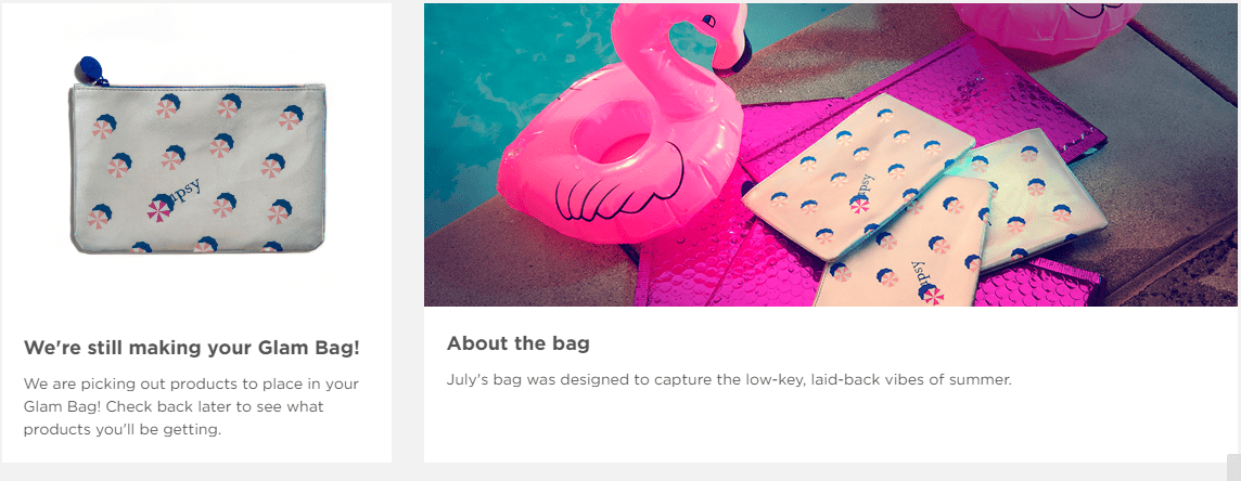
As you may have seen in June, I’ve been lured back to Ipsy. I got there just in time to see the website layout change. June was the same as it has been, but with July’s Hot Summer Nights theme, the Glam Bag page has taken on a new blog-like format. I get it; I change my blog theme seasonally too. Ipsy has created new features for the new theme. When you go to your personal Glam Bag page, you no longer see a thumbnail grid of the month’s items. It displays the month’s theme, then as you scroll down, it gives you a section called “The Story” which links to the themed photo shoot.

What was probably an attempt to connect with subscribers and get everyone feeling the vibe of the new bag actually feels more like a grab for attention, and reminds me of those charity campaigns. Like “Dear Subscriber, for just $10 a month, you can send fit, attractive women to exotic locales. In June, your contribution helped these ladies attend a pool party. No pool party would be complete without lots of jewelry and fuzzy coats, so we’re eternally grateful for your support. Without your help, these girls would have to stay in the pool, ashamed in nothing but bathing suits.”

Honestly, I think the photo shoots are a nice way to tie in the theme for banners, cards, social media covers and hype, and spoiler videos, but I feel like they’re pushing it a bit much by making it the prominent feature on what used to be a very personal area of the site. Maybe they needed to find a place to store their best photos rather than scrapping them from the site each month, but where the hell is my bag info?
As stated when the changes rolled out, you’re no longer required to share a link on social media to get early access to your bag. Once it’s ready, it’s supposed to just show up on your new page. As you scroll down, you get three more article links. One leads to the first sneak peek that was published at the end of the previous month. The next links to the themed Youtube video. The third may actually be the most useful, depending on what products are in your bag. Trend Alert shows you closeup suggestions for looks that you can create using some of the items featured in the bag. But where’s my damn bag?

Scroll down to the very bottom of the page and you’ll finally see the preview of your bag. If the bag isn’t ready, you’ll just see another theme image and blurb to the side. If your bag is ready, you’ll see thumbnails of only your items, and have to click through to see the full lineup for that month, unlike the previous design that just showed you the big grid with everything. Also, unlike the old site design, you can’t look back at all previous bags. You can see the six most recent and that’s it. I find this terribly interesting, because you can still review the items in your bag, but with a limited history, you can’t look back very far at other reviews. Apart from picking up a few reward points, what purpose do the reviews serve anymore?
Okay, I’ve been pretty harsh on the new design, but as I sit here mulling over how I feel, the design has accomplished its goal: keep people on the site longer. In the past, I’ve spent just a few minutes on the site, checking to see what I was getting, if there were new point rewards, and moving on. I didn’t spend much time thinking about the theme, other than how to decorate my own photo shoot of my bag for the blog. Now I click through to the photo shoot gallery to see if I can spot any product placement that might offer sneak peeks. I check out all the articles that used to be scattered over various social media platforms. I’m spending real time there. Jokes aside, it’s a very successful new design.
What do you think of the new Ipsy website? Does it feel more engaging? Will you be checking back for the articles each month?
